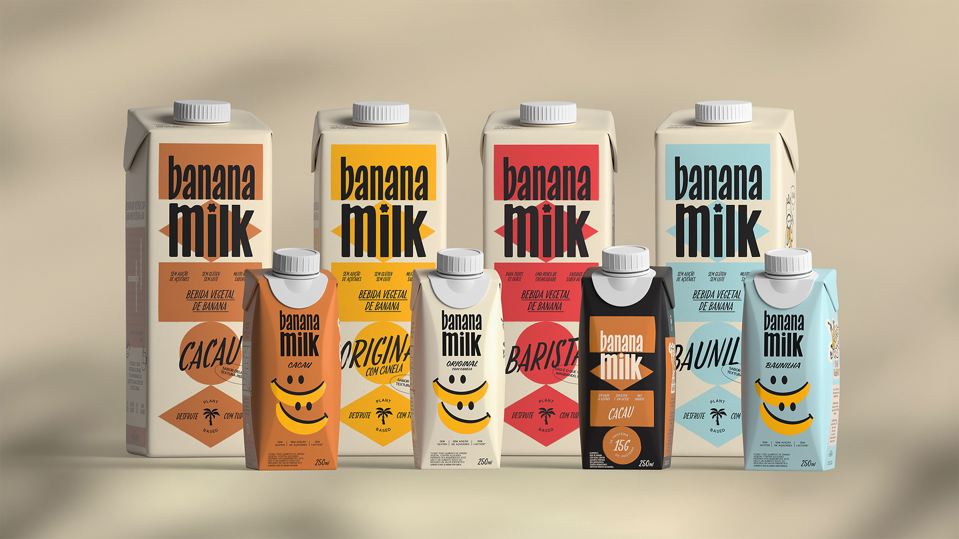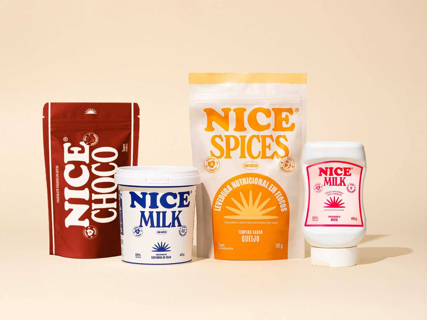

Banana Milk is the first plant-based milk made from bananas in Brazil — the land of Bananas. Founded in 2024 in Florianópolis, the brand is dedicated to offering plant-based food alternatives that meet the needs of individuals with dietary restrictions while ensuring a nutritious option for daily consumption. In 2024, the full branding and packaging design was developed for Banana Milk's debut product line, marking the brand's official launch.

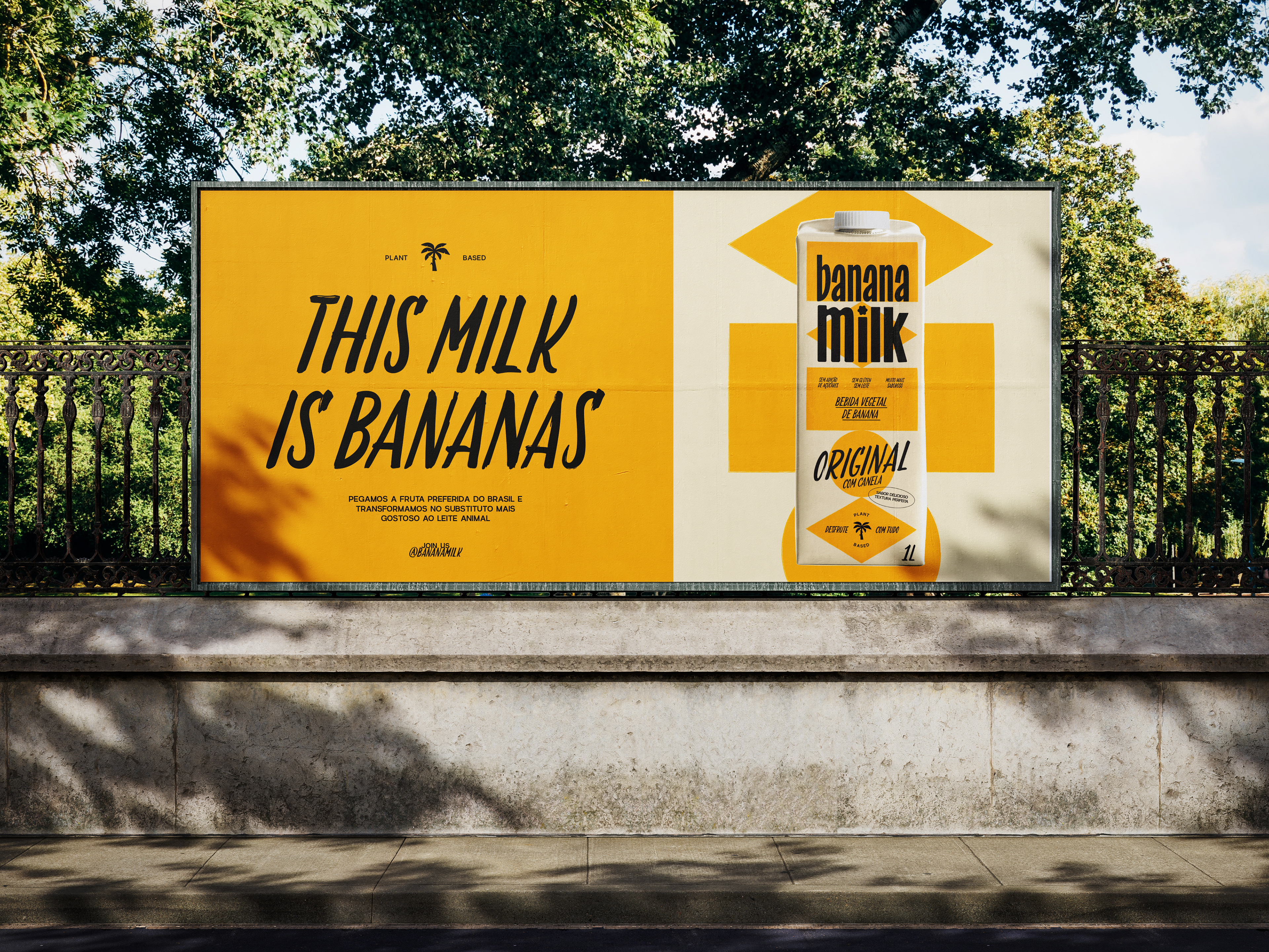
Brazil is the fourth-largest banana producer in the world, and the fruit plays a significant role in the daily eating habits of Brazilians. Recognizing this strong cultural presence, Banana Milk harnesses the country’s natural abundance and offers a plant-based milk alternative that is both delicious and free from common allergens present in other plant based milks.
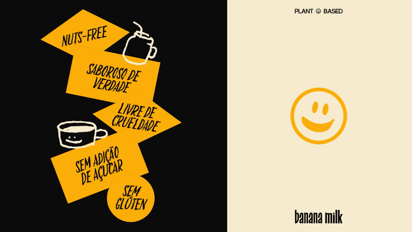
As the first brand in Brazil to produce milk from bananas, the challenge was about educating consumers and establishing a new category in the market. The branding and visual identity played a crucial role in highlighting the product’s nutritional benefits while maintaining a fun and engaging personality.
One of the main objectives for this project was to capture the richness of Brazilian culture in a way that felt fresh and free from clichés. The visual identity aimed to reference the Brazilian aesthetic while maintaining a contemporary and distinctive appeal.
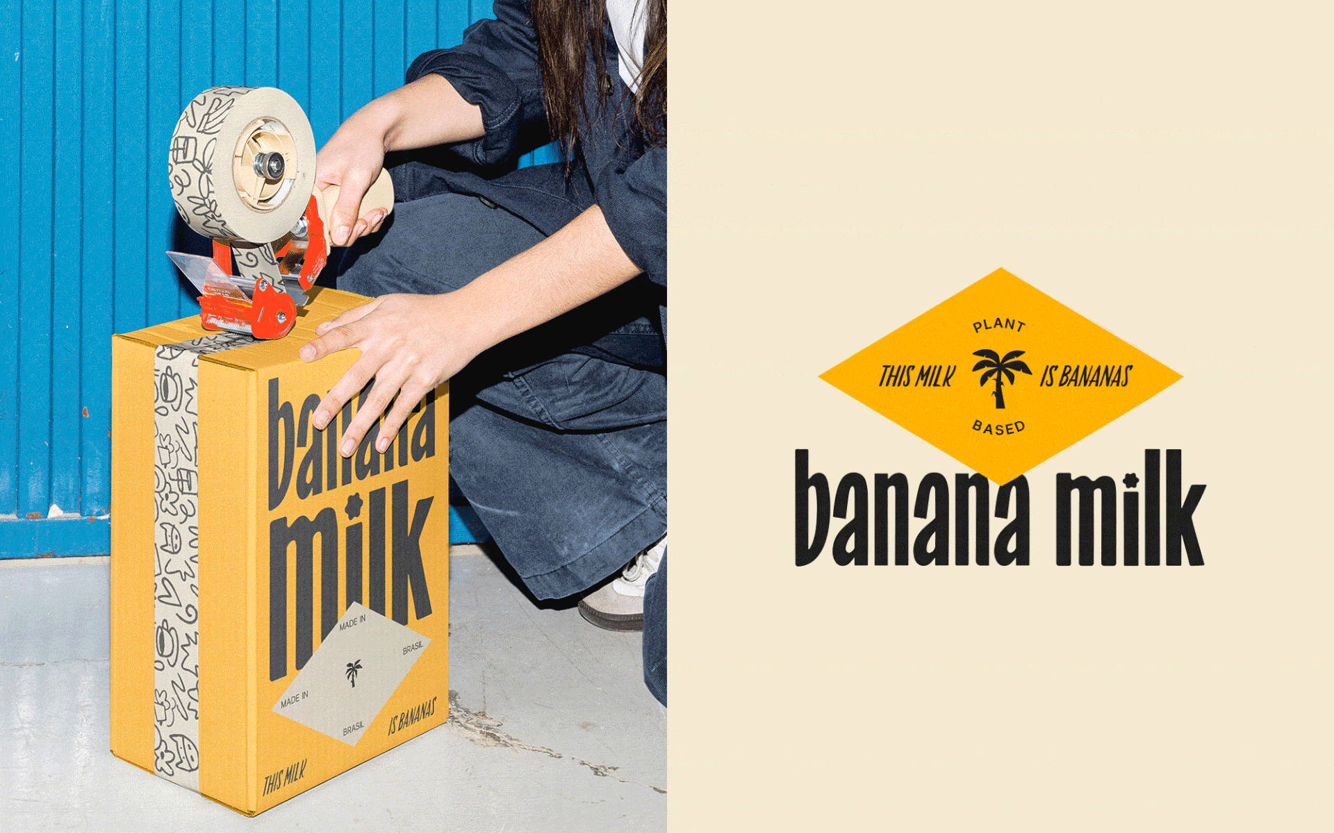
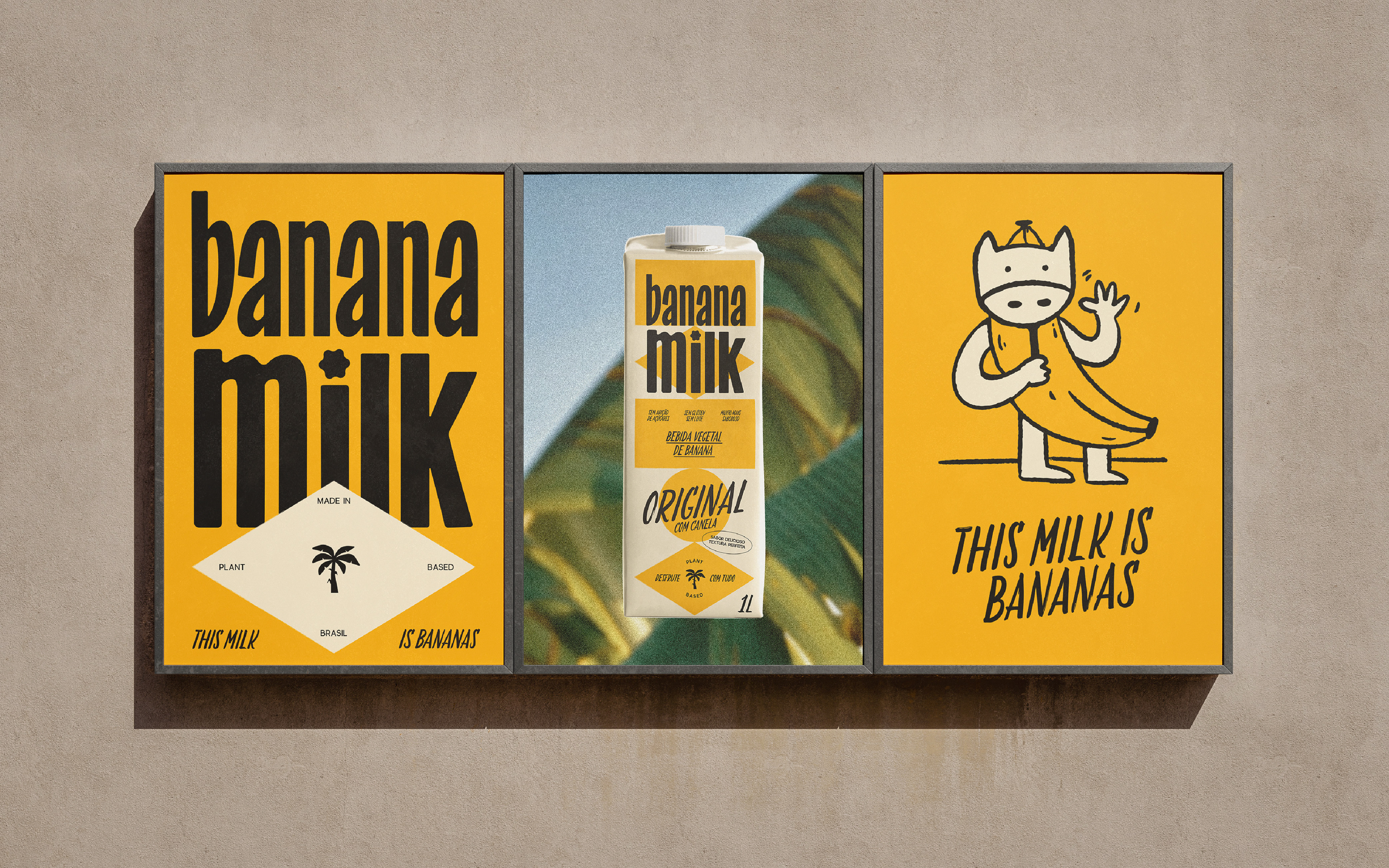
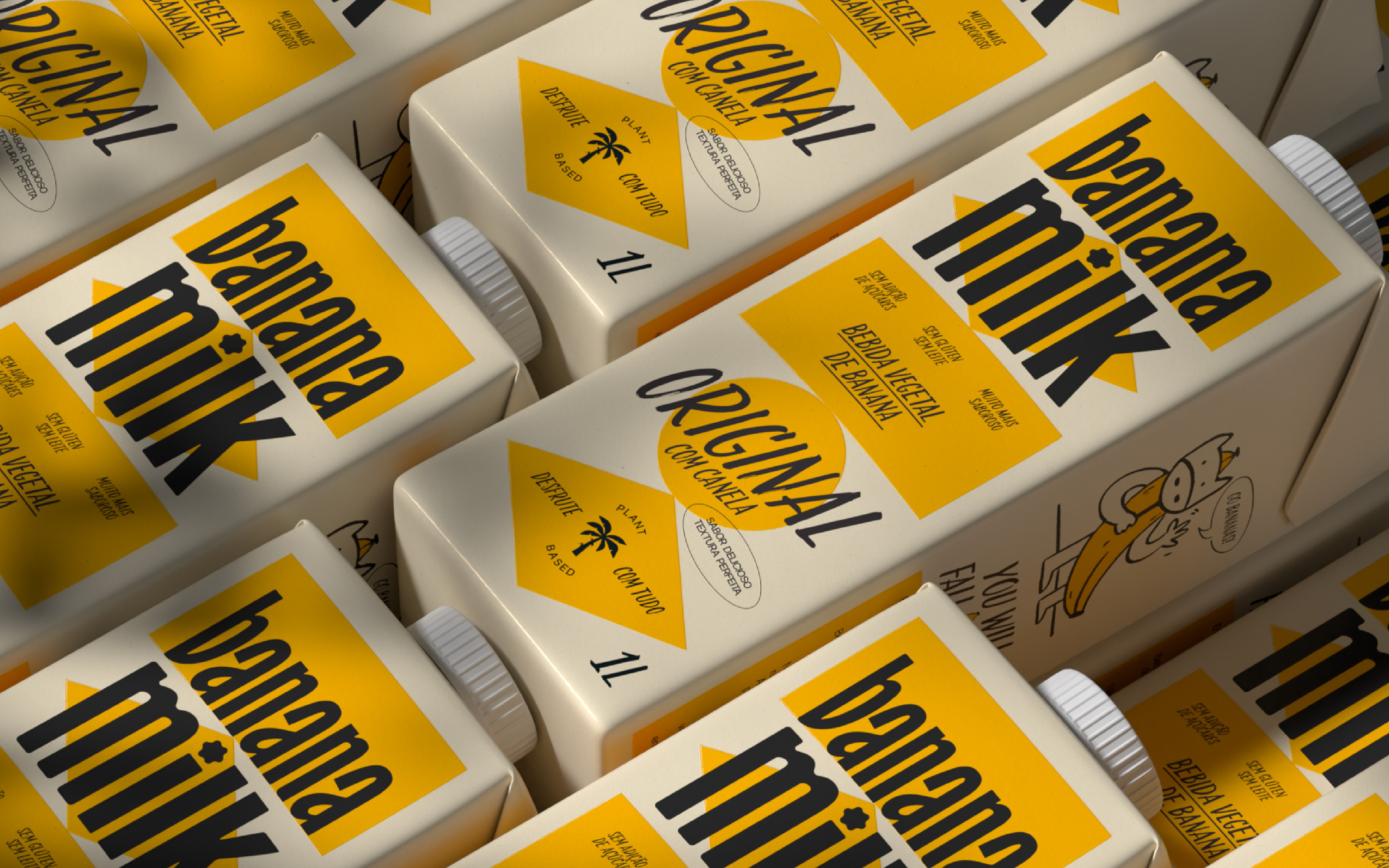
The logotype was designed with a handmade feel, drawing inspiration from Brazilian vernacular typography often seen in fruit market posters. This choice adds a sense of warmth and familiarity, reinforcing the brand’s practical, optimistic and welcoming personality


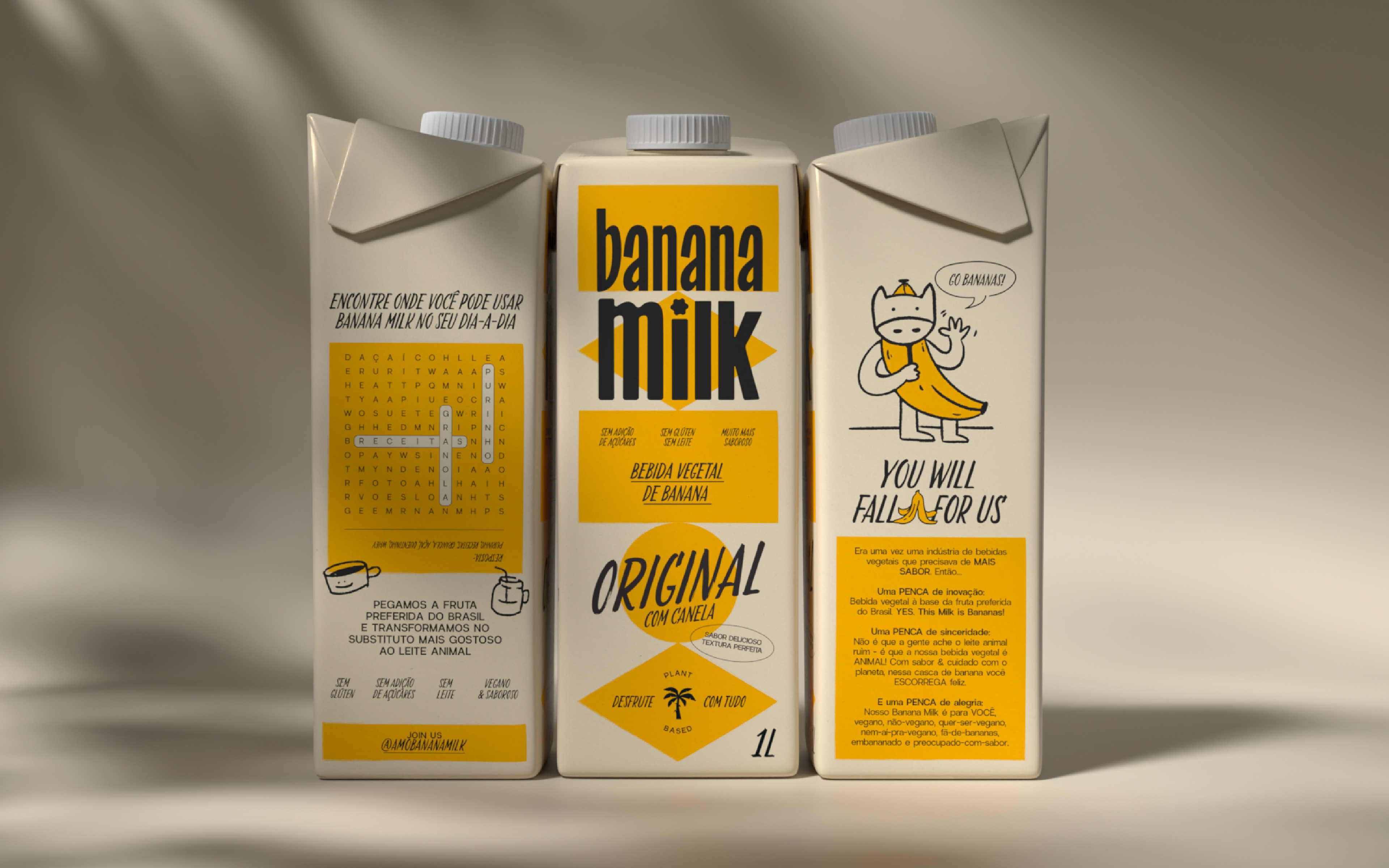
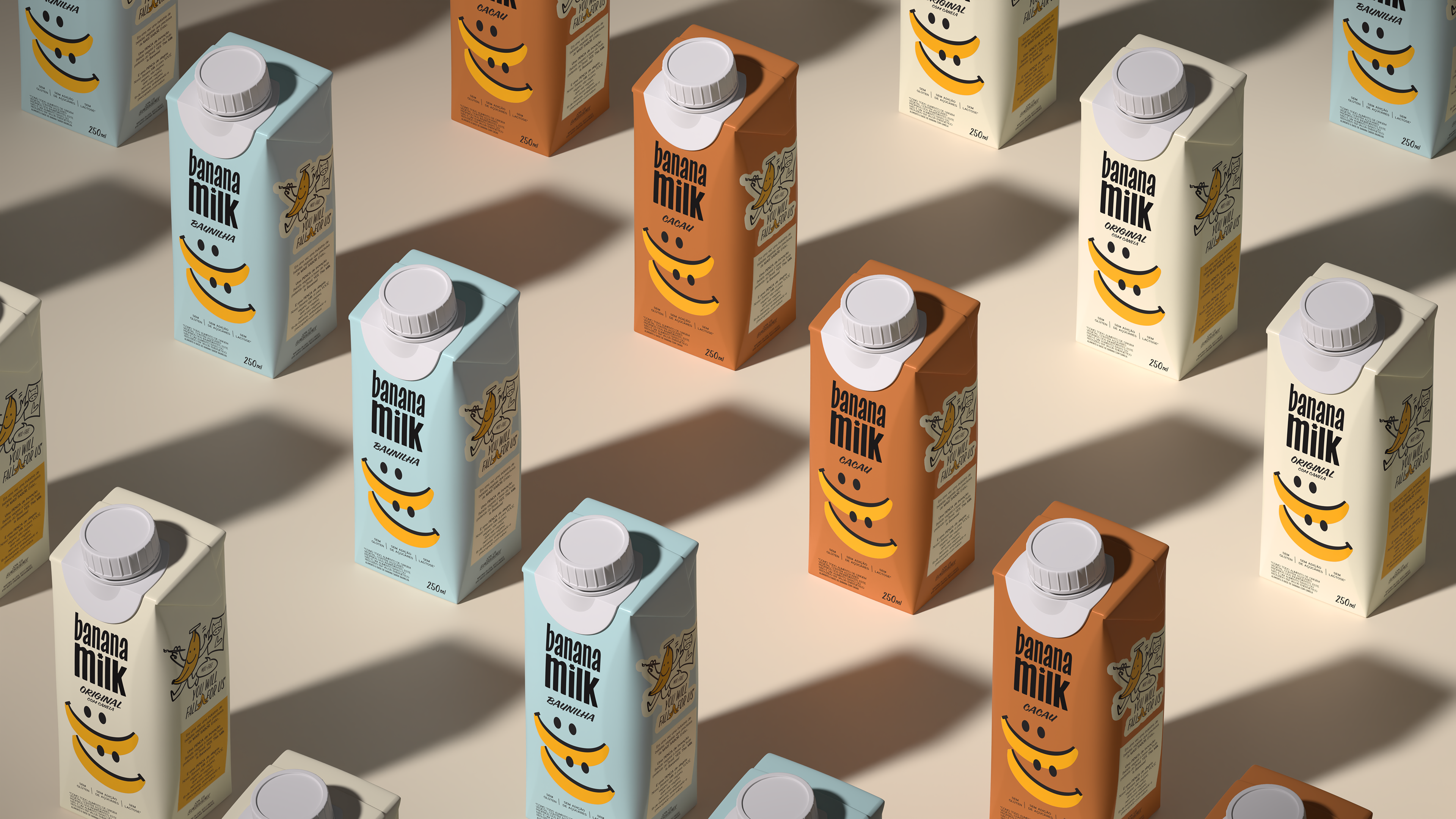
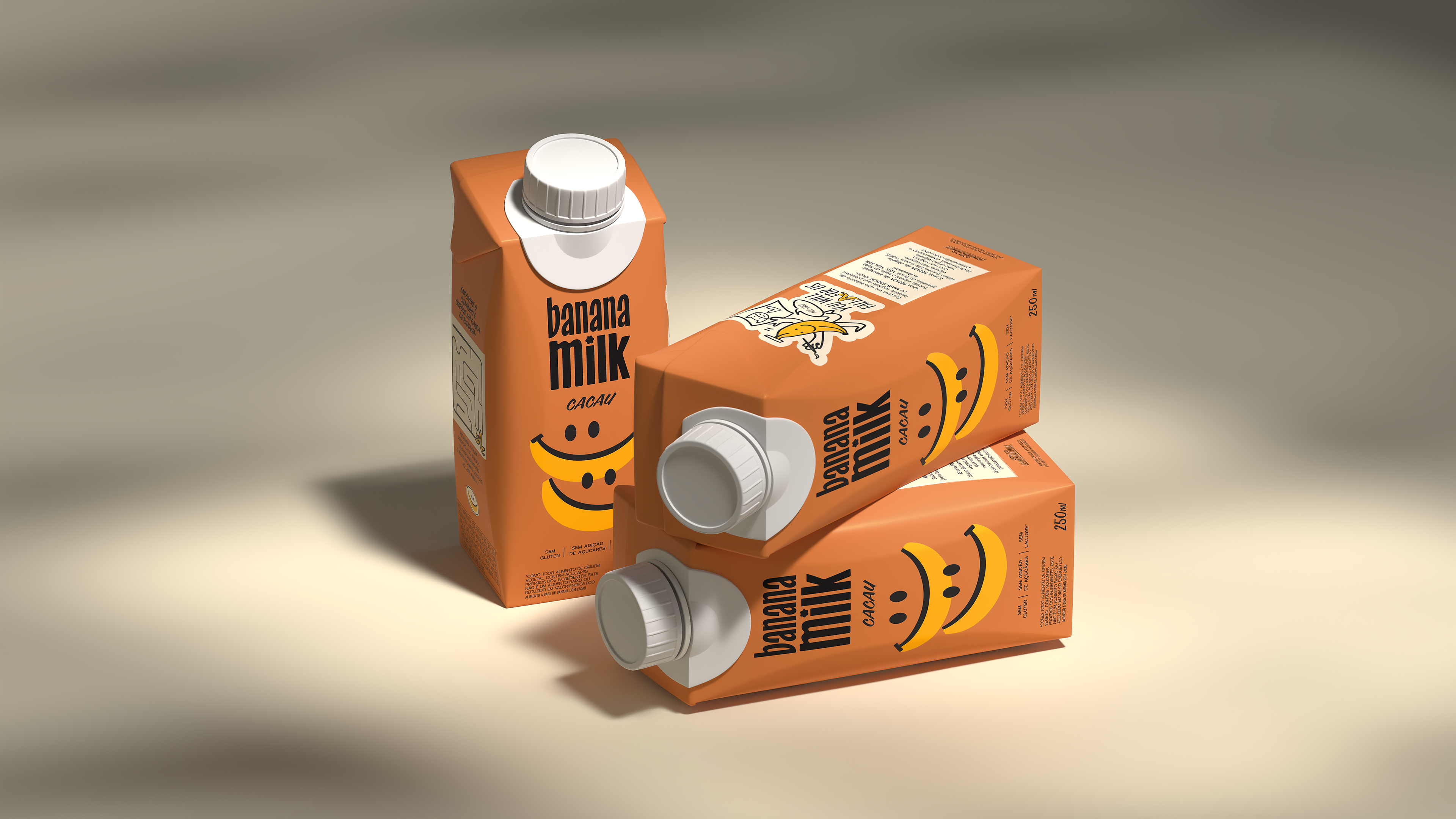
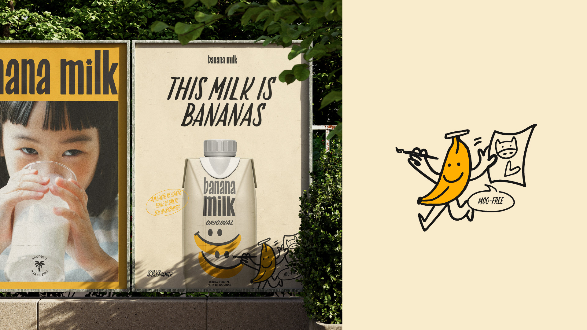
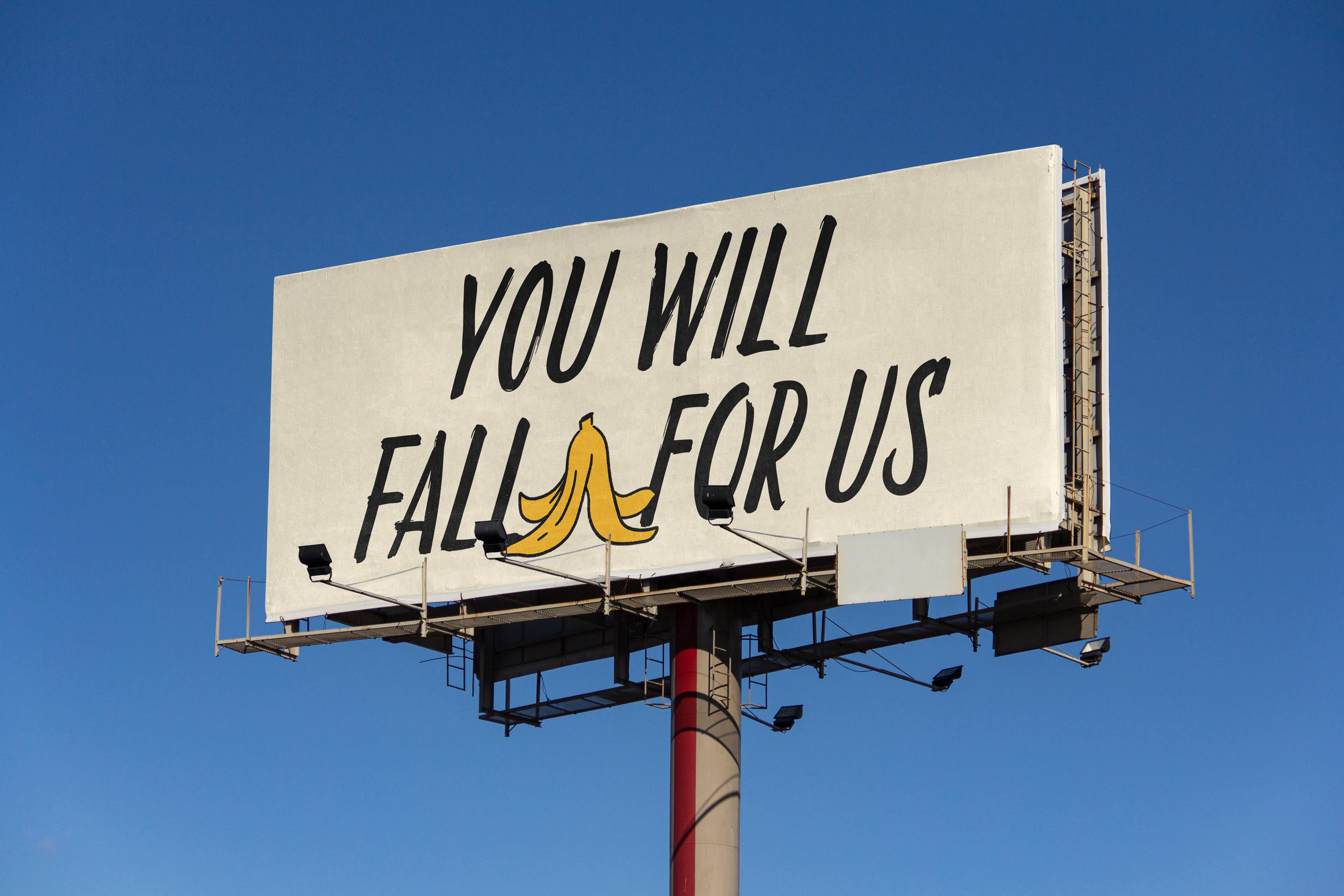
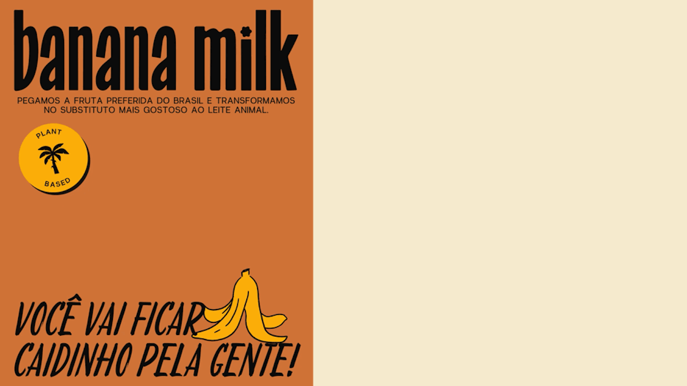
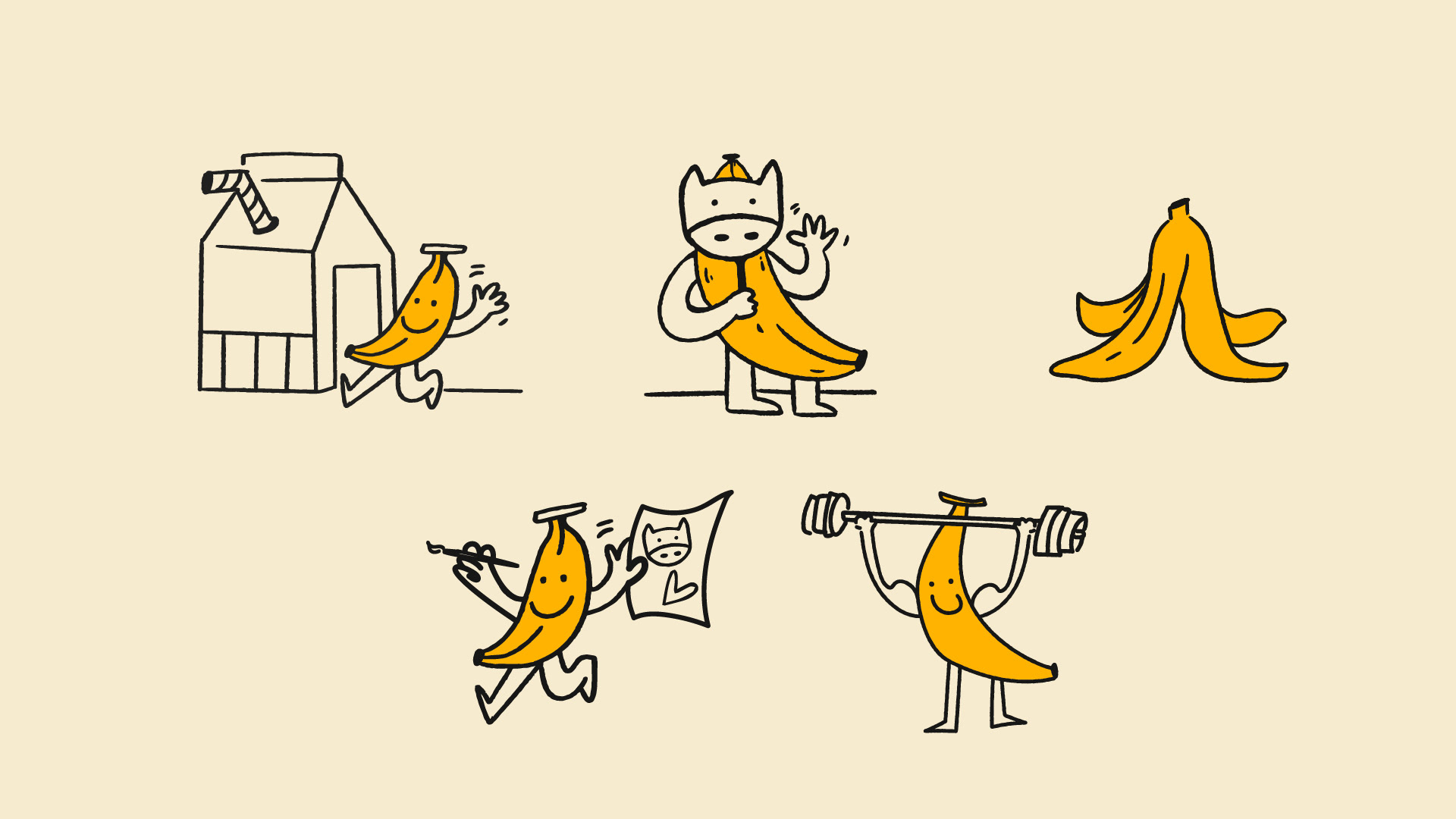
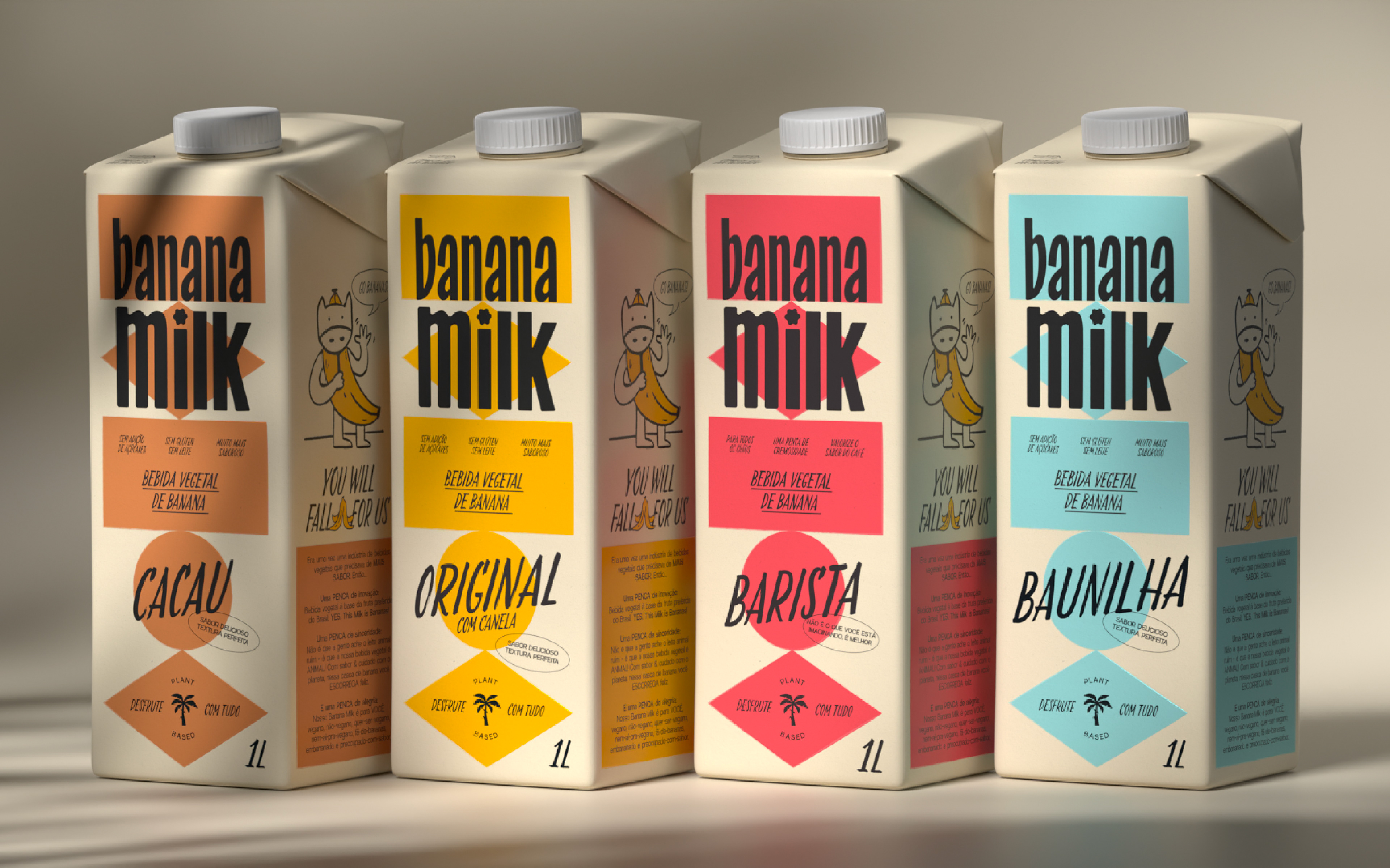
A key element of the identity is the banana character, which appears in various playful and unexpected representations. These illustrations help to define the brand’s universe, featuring imaginative depictions such as a banana dressed as a cow and a muscular banana. These visual elements contribute to the brand’s storytelling, making it engaging, humorous, and memorable.
The packaging system structure takes inspiration from the geometric shapes found in the Brazilian flag. This foundation provides a cohesive yet dynamic framework, with chromatic variations assigned to each flavor, ensuring clear differentiation while maintaining a unified visual language. The institutional color palette consists of yellow, cream, and black—tones that convey warmth and represent the banana itself—while a secondary palette of six colors, derived from the product’s different flavors, complement the brand’s visual identity.
3D and motion by Clint Studio
Illustrations by Bea Bastos